Painting camo patterns is rather interesting. When painting camouflage, there are a lot of concessions to make. If you use too realistic a camo pattern, then the minis will blend into the table and themselves. I mean, camauflage doesn’t pop- that’s the idea.
Here are a few real camo patterns:
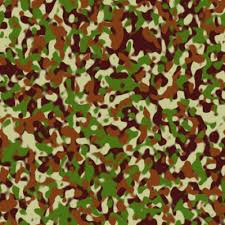
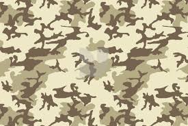
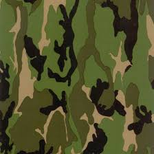
This would be far too busy for the miniature. In the end, we wouldn’t be able to see how well the mini was painted. And add to this some highlighting and shading, and you really have a disaster waiting to happen.
On a mini, you have to do some things differently:

Here is a simple Basilisk that I painted a little while ago. Battle damage was completely left off of it (my client’s request- I think he wanted to damage it himself).
So I exaggerated the different colored areas a lot for this. As is, I’ve made sure that there is enough metal on this mini to break up the pattern and make the whole thing more pleasing to the eye.
Another interesting thing to note is how this mini was highlighted up. Since the different colored areas are part of the same surface, it is important to make them look alike enough that we believe they are lit by the same source.
The final highlights for both the tan and green were done using the same color- so that the mini’s highlight layer blends together between the two parts. That’s really only true of the extreme highlights, but if is significant for the concept on the whole.
Leave a Reply
You must be logged in to post a comment.