Ok, so it has been a little while that I’ve been looking into all of the wonderful things to do with color theory, and I’ve come out with a few things to share.
The first one is a technique that I’ve come to call Bookending.
First off, let’s have a look at the color wheel.

This is one of the simpler versions, but that’s what we’re looking for here. Colors that are on opposite ends are complimentary. Essentially, that means that they have nothing in common (if you mix them together, you’ll get brown and grey).
In elementary school, my teachers always told me that complimentary colors just look good together. I never totally believed them, and they never had any other uses for the color wheel, so I ignored them.
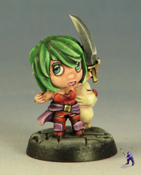
Until recently, when I decided to see what happens when you use them both on the same color of a mini. The jacket on this mini is painted green and shaded in red.
Since the two colors mix together on this mini, the tone of the color becomes more neutral. Even still, shading in complimentary colors creates a more dynamic look for the shading or highlighting.
But what else can you do? Well, I decided to try shading in one color and highlighting in the shade color’s compliment- both of which have nothing to do with the base color of the area. This way, both colors are present on the miniature, but they are never directly mixing together (ie- they don’t turn brown). The results are the opposite of what I got before:

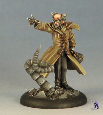
This guys was the first bookended mini I did. I actually painted him using the same base colors as this mini:

But the difference is stark. The bookended mini is a great deal brighter than the one that is not. That is the same blue I used on both of them, but the purple shading and yellow highlighting really makes it brighter. Even the brown has become a fairly saturated color.
From there I decided that bookending would define the aesthetic of my own Super Dungeon Explore force.
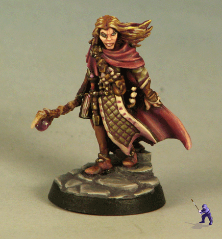
And later, I started thinking about using these methods to really define the way that light alters the colors on minis. This last one is an example of taking the entire mini and shading it with the same purple and highlighting to the same yellow. I tried to make him considerably more neutral (most of the paints I was using were very de-saturated). Here’s the result of that.
Leave a Reply
You must be logged in to post a comment.