At every gaming convention I’ve been to, there have always been a few classes offered on how to deal with certain colors that give people troubles.
These classes usually focus on how to paint colors to look yellow, red, white or black without making them look like some other color. Usually the advice is more or less as follows:
– For Yellow, make sure that you do not shade with black or any too grey a color, as this invariably makes the color appear green. Rather, use orangish browns for shadows.
– Keep Red highlights warm so that the minis doesn’t become pink.
– For White, start with an off white color that reads as white. Keep your shadows tight and your highlighting fairly broad.
– For black, the usual advice is to keep the highlights small and sharp to imitate a shiny black surface.
The thing is, these are not the only ways to approach these colors. For example, I often like to highlight red all the way up to pink and then bring it back to red by glazing the area with red, and yellow can look fantastic with some warm purple shadows.
Ultimately, I have been much more concerned with finding ways to make colors look interesting. When you want black or white to be the center of interest, just having some grey highlighting or shading won’t do. But you also have to make sure that your mini doesn’t end up looking too blue/red/purple because it is pretty easy for some strong shadow or highlight colors to overpower the neutral you started out with.
I have found that you can use interesting colors for these, so long as you keep the lighting consistent and make sure your highlight and shadow colors are not too similar.
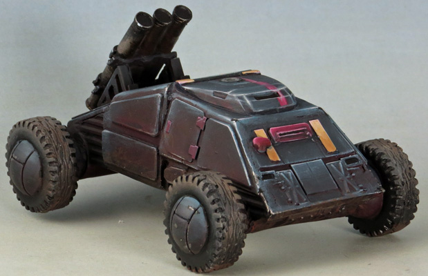
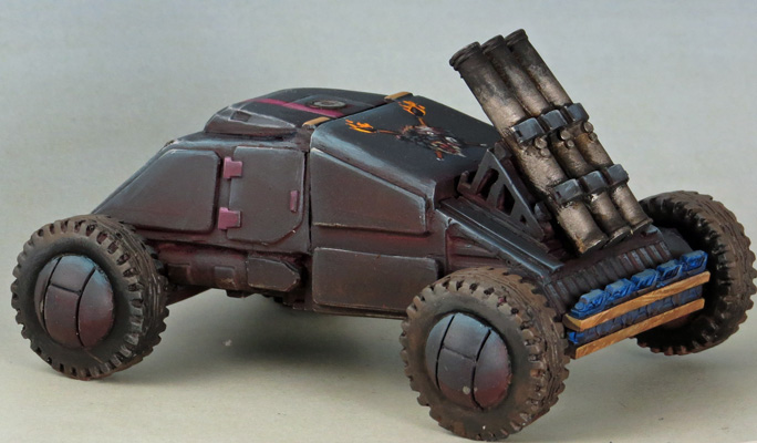
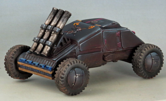
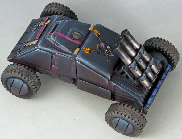
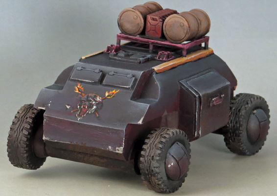
These vehicles are not the blackest of blacks, but I think the red shading and blue highlighting is really working for them. Warm shadows are counterintuitive to a lot of painters, which might be one of the reasons I like using them so much.

Leave a Reply
You must be logged in to post a comment.