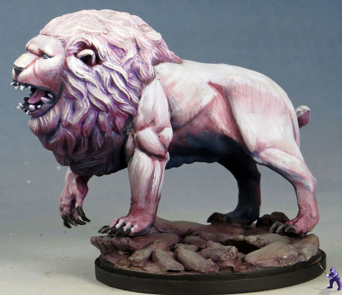
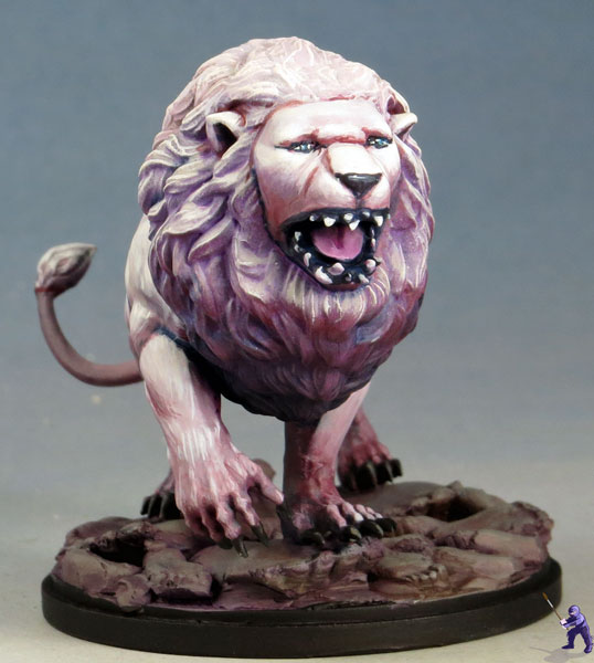
A lot of painters see painting white as a difficulty. It is tricky to shade white and still make it look like white, and it is even trickier to make it look interesting at the same time. Painters worry that too much shading might make it look grey, and having too much color in the paint will make it look like ‘light whatever’ instead of white.
These are legitimate concerns, and over the past few years, I’ve started experimenting with painting white with really vibrant and dark shadows.
I’ve come to the conclusion that there are a few tricks to make sure that the mini still ‘reads’ as white:
– Keep your lighting consistent. You can have very deep shadows on your white so long as it lines up with how the whole mini is lit. You can go all the way to black as long as the whole mini makes the area looks like it should be in deep shadows.
– Vary the colors for the highlighting and shadows. If you take something that reads white and shade it with a deep blue, then highlight it with an off-white blue, the mini will end up looking blue.
But if the shadows are in purple, and the highlights are in yellow, then it can still read as white. You can even vary your shading and highlighting further by varying them as you go up or down (shade with red then blue, highlight with green then yellow).
For this Kingdom Death White Lion, I did both of those things, and also tried out a fur texture technique. Overall, I’m rather pleased with how it came out, and I kind of wish I’d painted my own white lion with similar techniques.


1 Comment
1 Pingback